
The Challenge
The logo needed to address three key challenges:
Recognition & Readability – As the organisation has a new and relatively long name, the identity needed to incorporate strong visual cues that would make it instantly recognisable and easy to identify.
Symbolism & Identity – The logo had to reflect Nicosia, local government and the unification of the different public services under a single organisation.
Versatility Across Applications – The identity needed to be flexible and scalable, performing consistently across digital platforms, printed materials and physical signage.
Creative Concept & Inspiration
The logo draws inspiration from some of Nicosia’s most iconic landmarks and symbols, creating a visual identity that is both contemporary and timeless.
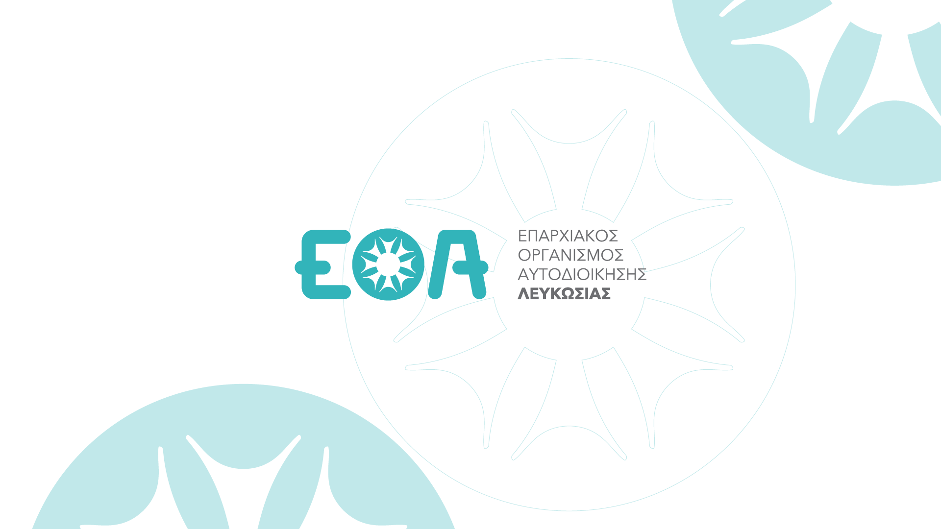
The Venetian Walls – The circular geometry references the city’s historic Venetian fortifications, one of Nicosia’s most recognisable landmarks.
Eleftheria Square & Contemporary Architecture – The fluid forms are inspired by the architectural language of Eleftheria Square, designed by Zaha Hadid, as well as the surrounding moat, combining heritage with a modern urban identity.
The Sun – The central circle symbolises the sun, a constant presence over the city and a universal representation of growth, vitality and optimism.
The Windmill – A subtle reference to the traditional windmills once used for water extraction, connecting the city’s history with its present-day role in public service.
The Letter “Λ” – The design also incorporates a stylised reference to the Greek letter “Λ”, reflecting both the eleven bastions of Nicosia and the city’s historical names throughout the centuries, including Ledra, Lefkothea, Lekousia and Lefkosia.
Design Approach & Brand System
The visual identity was developed around the principles of simplicity, functionality and contemporary design.
Colour Palette
The primary colour is blue, representing trust, transparency and reliability in public administration.
Grey and white were selected as supporting colours, reinforcing professionalism while ensuring flexibility across different applications.
Typography
The identity uses Avenir Next, a clean and modern typeface that enhances readability while conveying a contemporary institutional character.
Logo Structure
The logo combines the organisation’s initials with a distinctive symbol inspired by Nicosia’s architectural and historical identity, creating a recognisable and scalable visual system.
Department Identities
To strengthen organisational clarity while maintaining visual consistency, a dedicated logo system was developed for each department within the Nicosia District Local Government Organisation.
- Water Supply – Blue tones inspired by water and water resource management.
- Sewerage – Grey and green hues reflecting infrastructure and environmental responsibility.
- Solid Waste Management – A sustainability-focused colour palette representing circular economy principles.
- Development Licensing – Earth-inspired colours symbolising urban planning, development and growth.
While each department has its own distinctive colour identity, all logos share the same design language, typography and visual structure, creating a cohesive brand architecture across the organisation.
Applications
The identity system was designed to perform consistently across a wide range of touchpoints, including:
- Corporate stationery, business cards and official documents
- Digital platforms, including the website, email signatures and social media assets
- Building signage and citizen service points
- Promotional and exhibition materials, including banners, brochures and branded collateral
The result is a flexible and future-proof visual identity that reflects the organisation’s transformation while strengthening public recognition, consistency and trust across every point of communication.
